Movement and Meaning: Inside the Emotional Room
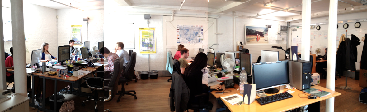
1/21: In a previous post, I call attention to the images above by their depiction of Productive Calm. That is, analysts spend long days intensely concentrated on computer analysis of data gathering and managing financial reporting on oil/gas developments. The day begins at 9:30AM and ends at 5PM, but analysts are often in the office anytime between 8AM and 7PM. They take no longer than 45 minutes lunch break outside the office, and sometimes lunch at their desks. Apart from eye movements, blinking, and constant finger typing, there is not so much bodily movement throughout the day. Analysts will get up from theirs seats to walk across the room to a toilet located in the office, but tend to avoid the casual practice of standing up and stretching.
In this display of images, I discuss the threshold of problem-solving that leads to physical movement by engaging a fellow analyst in the room.
Verbal communication is not as frequent as I would have imagined given the analysts proximity to each other. Actual physical movement by one analyst moving to the station of another analyst is rare. The two occasions when I notice it taking place are (1) when an analyst will walk by each station inquiring if he or she can make a cup of tea; and (2) when a problem arises that cannot be solved over electronic communication between the analysts. To explain: all the analysts in this room are constantly chatting to each other over Skype (less so over email because of the lack of immediacy and frequently also, the subject heading is often ambiguous possibly suggesting a greater time requirement for response than the instantaneous and “emotional” reaction offered by Skype chat).
In fact, with one-half the analysts working abroad in Ahmedabad (“India team”) and the other half located here on Fashion Street (“London team”), Skype also integrates both groups working on two sides of the world. Actually, with a Calgary (Alberta, Canada) office, the Evaluate Universe is never off-line for more than three hours per day. The Evaluate day begins at 4:30 AM Greenwich meantime (in Ahmedabad 9:30 AM India Standard Time) and ends 1:30AM Greenwich meantime (in Calgary 6:30PM Mountain Time).
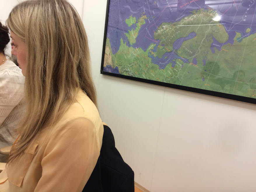
 In the above image, John Q. is seen sitting on the left (under the orange arrow), while Hannah K. is seen sitting on the right (under the red arrow). This is the regular order of the E. Universe. It would be dramatic to move a chair over to another analysts station without justification. Nevertheless, in the image below, John is seen sitting next Hannah, in close proximity while talking.
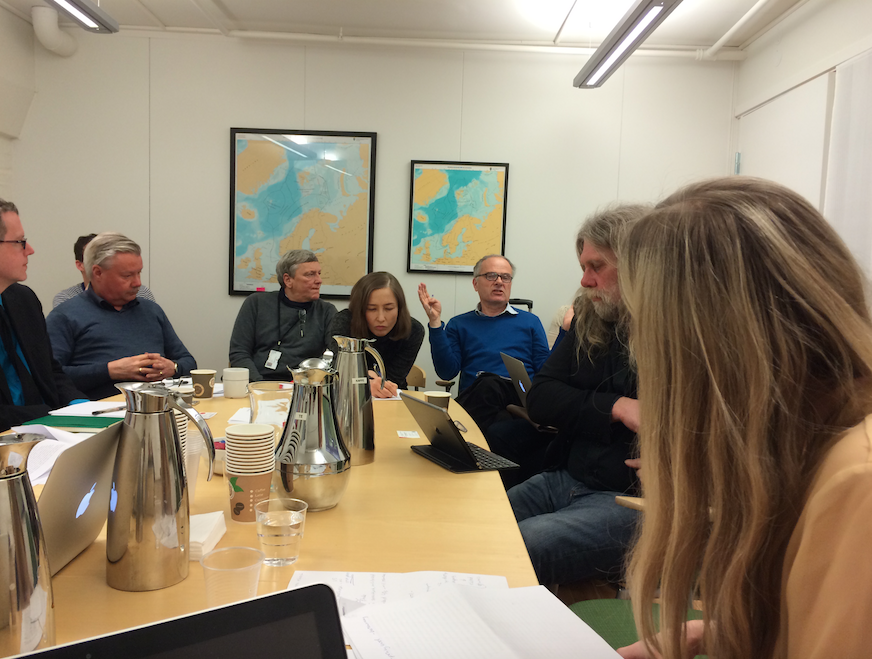
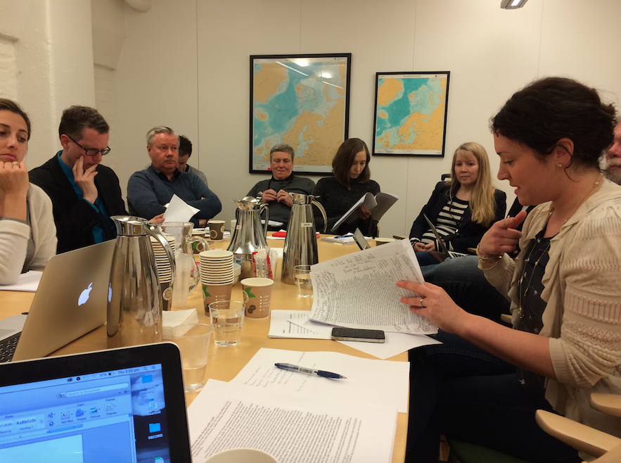
Over lunch, John explained to me that a problem takes place that cannot be solved over Skype. So, physical movement of one analyst to another analyst’s station is linked to problem solving. But what kind of problem? Yesterday, when I noticed John having moved his chair over to Hannah’s, I moved my own chair to sit in on their discussion, looking over their shoulder to get a sense of what what all the hubbub was about.
Hubbub
 On one level, there is a requirement of sitting next to Hannah, and using a hand movement to direct her attention to a particular place on the computer screen.
The location is quite specific, but in fact, it refers to one location from which the surrounding area can be discussed in reference to that location. The location is not the actual number he is point to directly, but in fact, the “column” of numbers, and its placement in relationship to other columns, suggesting a problem of hierarchy in taxonomy.

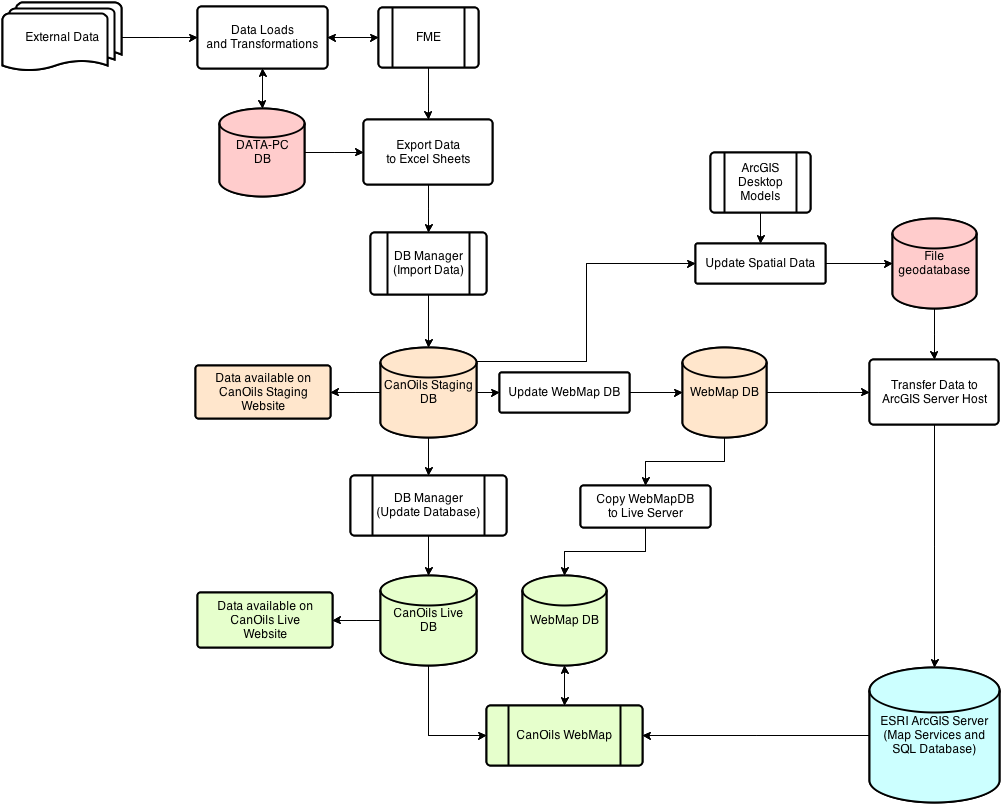
In particular, as in this image directly below, cropped from the above discussion, what is discussed is a relationship.
 On the far left, a column of numbers lies under a heading titled “Crown lands” which refers to an abstract identification number for a land tract provided by the federal ministry of Natural Resources Canada . To the right is a column headed by “Township Range”, which identifies the actual geographical location of the tract. The column on the far right is “Stratigraphic Description” which refers to the name of the actual geological layer in that tract. Oil and gas deposits can be situated vertically crossing various geological layers, each with their own permissions on working interest. For example, the columns in the middle titled “Top zone” and “Bottom Zone” refer to a specific geological layer, and the columns to the left, titled “Include/Exclude” indicate whether a geological layer is part of a particular tract.
In this particular case, the taxonomy of township over crown land would increase the likelihood that the stratigraphic permissions would be spread across the sheet (on the computer screen) in a more legible manner. So in this particular case, the issue of physical movement is associated with creating aesthetic legibility through rearranging a taxonomic hierarchy in which geological location (township identity) more closely identified working interest rights than federally assigned identification.
 So, in this case, after some discussion of both the situation and a plan to rearrange the appearance of data, Hannah takes notes on how to move forward.

The completed list of tasks for rearranging this taxonomy is shown directly above. This complete list is then “reduced” to a smaller sentence and inputed into Hannah’s over all main list of activities to do on this project, as seen in this image below:
Read Full Post »